Visual identity guidelines
01

Strategy

Different disciplines. One connected mind. This is what my brand stands for, who it's for, and the three ideas every piece of the identity has to carry. Start here before you touch a logo file.

Download brand foundations ↓

Who I am

I'm Keith de Alwis, a technologist, builder and operator. For 20+ years I've helped global organisations, ambitious companies and governments turn complex change into real-world results. Now, that means AI.

Keith de Alwis / Dubai & beyond
Real-world technology. Extraordinary outcomes.
01
Technologist

I understand the systems well enough to question them.

02
Builder

I make the thing, not just the slide about the thing.

03
Operator

I stay for the part where it has to work on a Tuesday.

The experience behind the thinking
{{ r.org }}{{ r.role }}

The anti-guru

There's no shortage of people selling AI certainty. I'm not one of them. I build things, run them, and tell you what actually happened. No motivational nonsense, no guru theatre, no promises the work can't keep.

I am
{{ a.is }}
I'm not
{{ a.not }}

Three brand ideas

Every decision in this book traces back to one of three ideas. If a piece of work doesn't carry at least one of them, it isn't finished.

01
Connection

Different disciplines, one connected mind. The node field is the idea made visible.

02
Calm confidence

Quiet grounds, light type, a lot of space. Nothing shouts because nothing needs to.

03
One signal

A single mint accent marks what matters. Use it once and it means something.

Audiences

Three kinds of people come looking. They want different things, but they all need to leave thinking the same thing: this person has actually done it.
{{ a.n }}
{{ a.title }}

{{ a.body }}

They need to feel: {{ a.feel }}

{{ a.link }} ↗
02

Gallery

The identity at work. Every mockup here is built from the system: the tokens, the type, the node field and the real logo files. Nothing borrowed, nothing improvised.

Download gallery files ↓
03

Logo

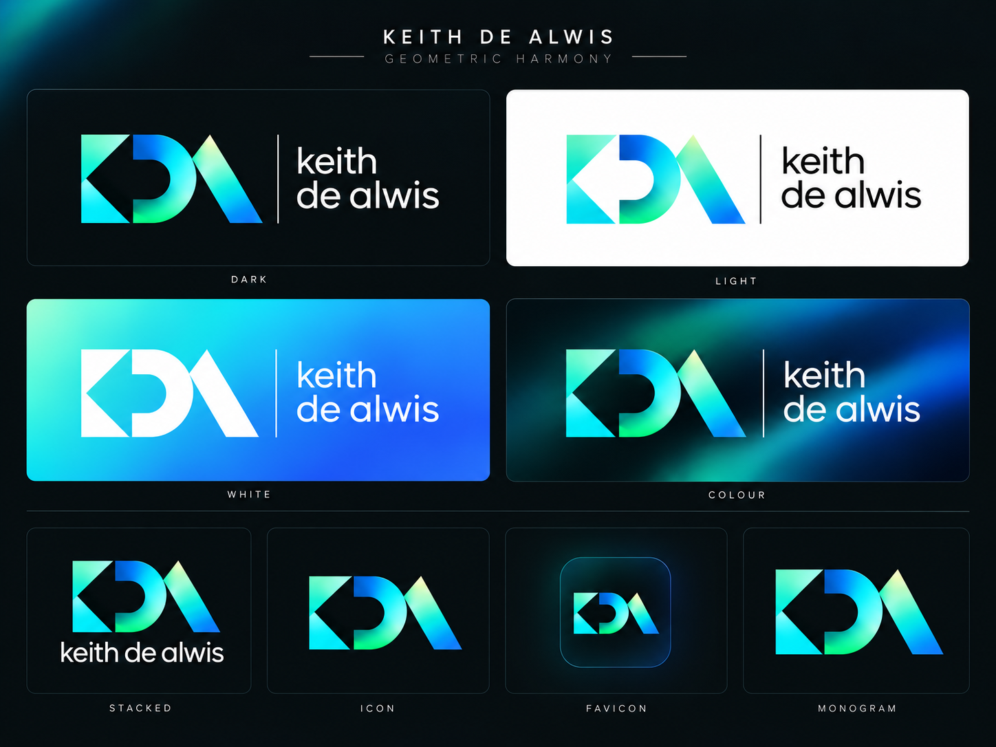
The KDA monogram is the signature on everything I make. It's geometric, luminous and deliberately simple. Always use the supplied files. Never redraw it, retype it or rebuild it from shapes.

Download logo suite ↓

Introduction

The primary lock-up pairs the monogram with my name. It sits on its own Night ground, and it's the version to reach for unless there's a reason not to.

{{ M.lockupDark }}

Monogram

Geometric Harmony. Three letters, one construction, built from the same few angles so they read as a single mark. The luminous spectrum is the only place the logo colours live.

{{ M.monogramTransparent }}
K

Two triangles turning inward. Two directions meeting at one point.

D

A stem and a half-round bowl. Structure, then something softer.

A

One leaning blade. Forward motion, and the unit of the exclusion zone.

The letters above are set in Manrope for labelling only. They are not the mark.

Wordmark

My name, in a quiet line beside the mark. The wordmark only exists inside the supplied lock-up files. Don't set it yourself in Manrope, or anything else, even when it looks close.

{{ M.lockupTransparent }}

Lock-up

Two arrangements. Horizontal for headers, footers and wide spaces. Stacked for square and portrait spaces where the horizontal would shrink below its minimum size.

{{ M.lockupTransparent }}
Horizontal / default
{{ M.stackedDark }}
Stacked / square and portrait

Logo and lock-up suite

Eleven files, each with one job. Drop each supplied PNG onto its tile once and it appears everywhere in this book.

{{ s.file }}{{ s.use }}

Exclusion zone

Keep clear space of x on every side, where x is the width of the A blade at its base. Measure it from the file you're using, at the size you're using it. Nothing enters the zone: no type, no edges, no nodes.

{{ M.lockupTransparent }}
x x x x

Scale

Below these sizes the detail goes. When the lock-up won't fit at 120px, switch to the monogram rather than shrinking it.

120px / 30mmMinimum width, lock-up. Screen and print.
24px / 8mmMinimum width, monogram. Favicons use the app icon file.

Colour and backgrounds

The mark keeps its spectrum wherever it goes. What changes is the ground. Match the file to the ground, never the other way round.

{{ M.lockupTransparent }}
Night bg / transparent file
{{ M.lockupTransparent }}
Surface / transparent file
{{ M.lockupLight }}
Paper / light file
{{ M.lockupReverseGradient }}
Panel gradient / reverse file
{{ M.lockupColourField }}
Colour field / as supplied
{{ M.monogramTransparent }}
Quiet node field / monogram

Misuse

If you're tempted to adjust the logo, don't. Here's what that usually looks like.

Don'tStretch or squash it.
Don'tRotate it.
Don'tRecolour the spectrum.
Don'tAdd glows, shadows or outlines.
Don'tPlace it on a busy ground.
KDA keith de alwis
Don'tRetype it, in any font.
04

Typography

Two typefaces, both light. Manrope carries the headlines, DM Sans does the reading. The weight stays at 300 so the type sits quietly and the ideas do the work.

Download typefaces ↓

Typefaces

Both are free on Google Fonts, so anyone working on the brand can use the real thing. No substitutes.

Aa
ManropeHeadlines · Light 300 · tracking -0.06em · line height 1.08
Aa
DM SansBody and labels · Light 300 · 16px / 1.8

Manrope

Geometric, open and a little technical. Set it light and tight: tracking -0.06em, line height 1.08. Use 400 only when light type has to sit very small.

ABCDEFGHIJKLM NOPQRSTUVWXYZ
abcdefghijklm nopqrstuvwxyz
0123456789 & ? . ↗ ↓ →

DM Sans

Warm and easy to read at length. Body copy is 16px on 1.8, light, in the text colour. Keep measure to around 62 characters.

Strategy through to delivery
See the whole. Move the parts.

The hardest problems rarely sit inside one discipline. I work across business and technology, connecting the decisions, teams and delivery that move transformation forward.

Teaching makes you question what you know. Practice gives you something worth teaching.

Type scale

Every style, from the closing line of a page down to the smallest label. Pick from the scale. Don't invent sizes in between.

{{ r.name }}{{ r.spec }}

{{ r.sample }}

Two-beat headlines

Every headline has two beats. The first sets it up in ink, the second turns it, in muted text or mint. Mint is for the line that matters most on the page, so use it once.

Mint second beat / hero
Real-world technology. Extraordinary outcomes.
Muted second beat / section
Many roles. One connected perspective.
20+ years building what comes next. Now, that means AI.
Build something bigger than us.
Think deeply. Share openly.
What could we make possible?
Think deeply. Share openly.
DoTwo beats. Set up, then turn.
Think Deeply, Share Openly and Grow Together!
Don'tThree beats, title case, heavy weight, all mint, an exclamation mark.

Eyebrows and labels

DM Sans at 12px, uppercase, tracked +0.16em, in the subtle text colour. Slashes separate levels. They orient, they never shout.

01 / The intelligent organisation
Keith de Alwis / Dubai & beyond
Technology / Transformation / AI
Scroll to explore ↓
05

Colour

A dark, quiet field, lit by a single mint signal. Night is the default for everything on screen. Paper is for documents. The spectrum belongs to the logo and a handful of brand moments, nothing else.

Download colour tokens ↓

Night

The default theme, and the one this book is set in. Near-black grounds with a trace of green, four steps of text, a white hairline and the mint.

{{ c.token }}{{ c.hex }}{{ c.use }}

Paper

For proposals, reports and anything printed. The mint darkens to hold its contrast on a light ground.

{{ c.token }}{{ c.hex }}{{ c.use }}

Logo spectrum

Six luminous colours that live inside the monogram, plus the panel gradient for covers and openers. Never use them for type, UI or charts.

{{ c.token }}{{ c.hex }}
One signal.
logo.panel-gradient#72f3d4 to #1f5df8 at 135°. Covers and openers. Type on it is Night bg.

Proportion

Mostly dark. Text where it's needed, hairlines to organise, and mint in small doses. If you can see more than a sliver of mint, there's too much.

bg
surface
text

A guide ratio, not a rule: roughly two thirds ground, a fifth surface, a tenth text, the rest hairline and mint.

Contrast

Every text colour clears 4.5:1 on its ground. Ratios below are calculated from the token values, WCAG 2.2.

Aa
{{ p.label }}{{ p.ratio }} · {{ p.verdict }}
06

Photography

Dark, desaturated and atmospheric. Renders set the mood, portraits put a real person in it. Either way, the image never competes with the words on top of it.

Download photography guidance ↓

Approach

Three settings do most of the work. Get these right and almost any image will sit in the brand.

01
Dark

Low key, deep shadows. The image should meet the Night ground without a seam.

02
Desaturated

Pull colour back until only a cool, green-grey tone is left. The mint stays the only bright thing.

03
Atmospheric

Light, haze and space over props and detail. Suggest, don't explain.

Portraits

Real photographs of me, never stock faces. Natural expression, low light, room around the head. Text sits on a bottom scrim, never across the face.

A note from me. Every Sunday.The Sunday Blueprint.
LightOne soft source, from the side. Let the far side fall into shadow.
GradeCool shadows, skin kept natural. No filters, no heavy retouching.
FramingHead and shoulders or wider. Leave the lower third clear for type.
SourceShown: keith-author.webp from de-alwis.com. Drop in any approved portrait.

Renders

For ideas that don't have a face: abstract, dark, lit from within. These are the role images from de-alwis.com, one for each discipline.

01 / Business consultant
02 / Open source
03 / AI for Business
04 / CTO
05 / Programme management

The scrim

When type sits on a photograph, a gradient to Night bg carries it. Start clear at about the middle, reach 90% at the bottom. Check the text still clears 4.5:1 over the brightest part.

Connecting intelligence to action.
Without scrimLegibility depends on luck.
Connecting intelligence to action.
With scrimbg at 0% from 45%, to 90% at the bottom edge.

Do and don't

The same image, treated three ways.

Dark desaturated render
DoDark, cool, quiet. Meets the ground.
Over-bright saturated render
Don'tBrighten or boost saturation.
Render with a colour wash
Don'tAdd colour washes or duotones outside the palette.
Stock handshake
Don'tUse stock people, pointing at screens or shaking hands.
07

Illustration

One illustration style, used everywhere: the node field. Pale points joined by hairlines, with the occasional mint spark. It's the brand idea drawn literally, many disciplines, one connected mind.

See it live on de-alwis.com ↗

The node field

It drifts slowly on screen and holds still in print. Motion pauses for anyone who prefers reduced motion, and there's always a pause control.

Anatomy

Three elements, nothing else.

Nodes

Pale ink points, 1.5 to 4px across, at varied opacity so the field has depth.

Hairlines

1px white, fading with distance. Only near neighbours connect.

The spark

One mint node with a soft glow, its links lit mint. The one signal, in the field.

Density

Match density to the job. Sparse behind long reading, balanced for heroes, dense only as a full-bleed moment with no type on it.

Sparse / behind reading
Balanced / heroes and covers
Dense / image only

Composition

Weight the field away from the words. Nodes gather on the far side and thin out behind the type, so the headline always has calm ground.

03 / Progress that can be shared
Build something bigger than us.

Do and don't

The field should feel like a thought, not a circuit board.

DoPale, open, one spark.
Don'tCrowd it or scatter sparks everywhere.
Don'tColour it with the logo spectrum.
08

Iconography

There's no icon set. Nine typographic glyphs do the job, set in the same type as the words around them. The only drawn icons are for social platforms.

Download social icons ↓

Glyph set

Each glyph has one meaning. Arrows are always mint. The rest take the colour of the text they sit with.

{{ g.g }}
{{ g.name }}{{ g.use }}

Arrows

Calls to action are words plus a mint arrow, not buttons. The label is ink, the arrow is mint, a single space between them. Hover shifts the label to accent-soft.

Let's talk ↗↗ Leaves the page, opens a conversation or another site.
Explore my world ↓↓ Moves further down the page, or downloads a file.
Continue →→ ← Step forward or back through a sequence.
See what I'm building ↗Small caps version, for eyebrow-sized links.

Social icons

Single-path icons at 14px, in ink, 8px from their label. Use the supplied SVGs from the design system. Where space allows, the name and an arrow is better than the icon alone.

Preferred / text links
LinkedIn ↗X ↗Instagram ↗Facebook ↗GitHub · coming soon
Icon spec
LinkedIn X Instagram Facebook
14 × 14px box, one path, ink fill, 8px gap. Dashed boxes mark where the supplied SVG goes.

Do and don't

When you reach for an icon, ask whether a word would do. It usually would.

Let's talk  ↗
DoWord, space, mint arrow.
Let's talk ↗
Don'tSet arrows in ink.
Contact me
Don'tBox calls to action in mint pills.
Emoji / icon library
Don'tUse emoji or pull in a generic icon set.
09

Language

I write the way I'd say it across a table. Plain, short, a little dry. If a sentence sounds like it came from a brochure, it goes.

Download voice guide ↓

Principles

Seven rules. Break none of them.

{{ p.n }} {{ p.t }} {{ p.b }}

Mechanics

The small stuff that keeps it consistent.

Punctuation

Full stops end headlines. Slashes join levels: 01 / Experience in practice. Middle dots separate lists.

Numbers

Figures, not words: 20+ years, 5 roles. Two-digit numbering for sections: 01, 02.

Dates and places

16 Feb 2026. Dubai, UAE · Working across borders.

Names

Keith de Alwis, lowercase de. AI, DPI, DPG and CTO stay in capitals.

Use and avoid

If the word on the right slips in, swap it for the one on the left.

UseAvoid
{{ u.u }}{{ u.a }}

In practice

Real lines from de-alwis.com, and the rewrites that got them there.

Dry humour, once
Sorry. This is the bit where I interrupt you.

You were happily looking around and now I'm asking for your email. Awkward.

Plain promise
Market shifts. Useful tools. No motivational nonsense.

Just a useful Sunday read to make Monday slightly less painful.

Unlock the transformative power of AI for your business today!Move from AI possibilities to useful applications.
We deliver end-to-end, best-in-class transformation solutions.See the whole. Move the parts.
Reach out to schedule a discovery call with our team.Bring an idea, a challenge, or a different perspective. ↗
10

Resources

Everything you need to make something on-brand, in one place. Start from the tokens, not from a screenshot.

Download all assets ↓

Download everything

One file with every logo, the tokens in JSON and CSS, and a readme. If you only take one thing, take this.

kda-brand-assets.zip / logos · tokens · readmeAll brand assets. One download.↓

Individual files

Need just one thing? Every file is here on its own.

Source and system

The full design system lives in the repository. Access needed, so ask me if you don’t have it.

Resources
{{ cur.res }}{{ cur.resNote }}↓